Posts

Comparison of Newspapers

Image
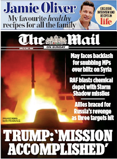
The mail shows the bombing to be a thing as they are right wing. This is shown in their headline "Trump: 'Mission Accomplished'" This was positive connotations in the way that they think bombing them is the right move. The mail do call out May but not for the bombing. They call her out for "snubbing MPs" about the decision. This shows that they are in support of the strike which is indicative of the right wing. The independent features less sensationalism in there pictures and headlines this is because the independent is a centre base newspapers. This also means that there is criticism of Mays decision. The independent also features more muted colours and less outlandish images and headlines.

Music Video Revision

Image
The band massive attack was created during a time when there type of music was very new and few people actually now of it existence. The original members of massive attack met when they all playing music near by and found out they all liked the same music and after "jamming" decided to form a band and released songs like massive attack. their time making music you can always tell for them its about the music rather than the fame or fortune that found them. Unfinished Sympathy is about how the singer is worried about starting a new relationship after what had happened in her last relationship. The song started out as a jam between some friends and turned in what we heard after they decided to add in an orchestra. Unfinished Sympathy has the singer in the foreground which we focus on and the other band members are walking in the background behind her slightly out of focus showing them to take pride in their work but not to be fame hungry. Massive Attack Used a single take shot

Dance Music Video Questions

Image
1. what makes all of these music videos from the dance genre? All of these videos focus more on the dancing than than the actual music being played and the singer. The singer nearly always doesn't appear in the actual video singing and only actually appears in the video at all. The music appears to fit more in with the dance being done in the background. 2. Explore how the artists are using representation to appeal to their target audience in these three videos by picking out key frames from the video to analyse. This screen grab shows the demographic of typical teenagers in the eyes of adults who control these adverts. This doesn't really represent what teenagers do or are like. This is how the video is supposed to connect with the audience of teenagers that the video is supposed to appeal to. The Cola video shows a group of people, who we assume are drinking,  and having a party this is supposed to appeal to the teenager. This is supposed to represent what te

3 Point Lighting

3 Point lighting is where you have 3 main lighting points one that focuses on the subject, the Key Light. Another which lights the entire scene, Fill Light. The final one that hits the back of the subject this means the subject is easily distinguished from the background, this is the Hair Light. This is the basics of cinematography, that all cinematographers use when filming any scene and huge changes can be made by simply making small adjustments to each of the lights.
Video Comparison

Image
The Similarities between the two shots are that we both had one person standing in front of the plain background. the camera angle we used was very similar to the original A straight on wide shot showing some of the surrounding area and background. We managed to match the style of outfit that the actors were wearing as they both wore a jacket with a tie. The lighting of the shot was also all natural light like the original. the differences of the shots include, the outfit while the same style are different looking as ours used a school uniform and the original had a full colourful suit. the location was different as well as we used the wall of a school building and the original used use the fence and corner or a building in London. The lighting in both videos used natural light this was because the original was standing in front of a white building which means a lot of light was being reflected back at the subject and camera. The mise en scene for ours was slightly off as we could

Questions

How I’m linking my idea to the media theoretical framework. Product 1 - The two BillBoard Posters -  I will use short lines containing rhetorical and/or alliteration to create catchy and memorable lines for the poster to make people remember what they have read and what it is that is being advertised. This is important as people will only look at the poster for a very short amount of time so I only have a few seconds to catch someone's attention. One way of doing this is through clever word usage. I will use words, phrases and (conjugations if applicable) to target my audience age range. In order to make sure that the posters are not seen as offensive or “cringy” I will ensure that nothing stereotypical is used in order to keep the poster catchy and rememberable for the right reasons. This is crucial as, if the poster is considered offensive or if people feel it is making fun of a certain group of people it will get exposure for the wrong reasons creating very bad publicit